
Getting your package label design right is a critical step that many brands overlook. You’ve perfected your product, but if it sits on a shelf or appears in an online store with a label that fails to connect, looks cheap, or peels away, your investment is wasted. The solution is a strategic approach to package label design that considers aesthetics, materials, and application from the very start.
A successful package label design combines brand identity, clear communication and practical production requirements. Research on cosmetic packaging discusses how visual and verbal design elements communicate a brand1. It must not only look good on a screen but also adhere to the selected container, remain legible in the intended viewing conditions, and be assessed for the expected conditions from distribution through use.
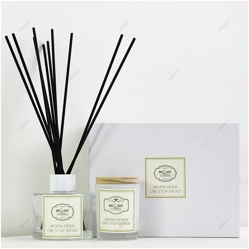
This guide will walk you through the key decisions involved in creating a label that does justice to your product. From choosing the right materials to ensuring consistency across your entire product line, we will cover the essential checkpoints for a professional and effective package label design.
What Should Your Package Label Communicate at First Glance?
Is your label trying to say too much, leaving potential buyers confused? A cluttered label can overwhelm customers, causing them to move on to a competitor's clearer, more confident presentation. The key is to establish a distinct visual hierarchy.
At first glance, your package label should instantly communicate three things: your brand, the product category, and the key differentiator (like the scent, flavor, or primary benefit). This is the core information a customer needs to make a quick purchasing decision.

Dive Deeper
A label is your product’s silent salesperson, and its first impression is made in seconds. Whether on a crowded retail shelf or in a fast-scrolling e-commerce grid, readable typography helps communicate the product2.
Establishing a Visual Hierarchy
A qualitative study of food warning labels in China illustrates how design choices affect the understanding of information3. For your package label design, I recommend setting a clear priority. What is the single most important thing you want a customer to remember?
- Primary Level (Largest/Most Prominent): This is usually your brand logo and the product name (e.g., "Soy Wax Candle"). These elements should be immediately recognizable.
- Secondary Level: This includes the specific variant, such as the scent ("Sandalwood & Musk") or model. This helps customers differentiate between items in your product line.
- Tertiary Level: This is for supporting details like net weight, key features ("Hand Poured"), or brand location. Treat these as supporting details while respecting any required placement, prominence, or type size.
Differentiating Your Product Line
If you offer a range of scents or variations, your labeling system must make it easy for customers to find their favorite and discover new ones. This can be achieved through:
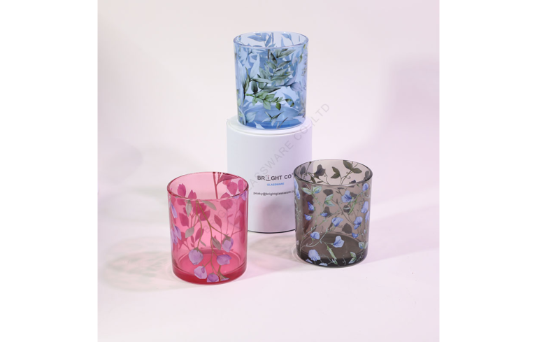
- Color Coding: Use a consistent signature color for each scent together with a clear text name. Packaging color can shape product expectations4, so check whether the chosen associations make sense to your audience.
- Illustrations: Employing unique graphics or patterns for each variant.
- Typography: Using a consistent font for the brand name but a different, clear font or style for the scent name.
The goal is to create a cohesive family look while ensuring each product is individually identifiable. This consistency builds brand recognition and trust over time.
How Do the Glass Shape and Surface Affect Your Label Design?
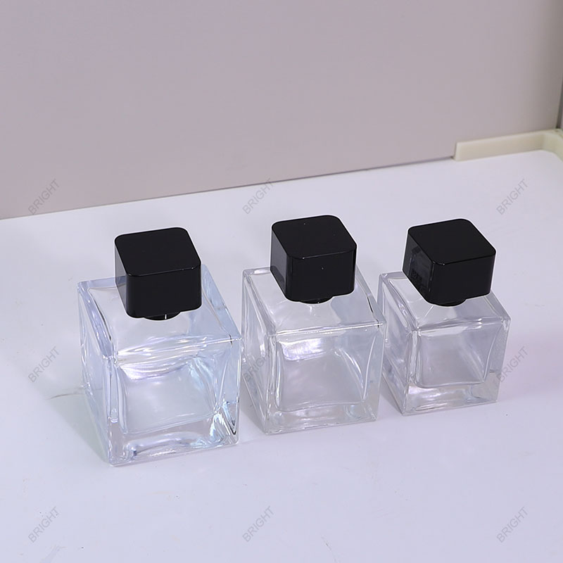
Has a beautiful label design created on a flat screen ended up looking distorted, wrinkled, or illegible on your final curved glass jar? The physical properties of the container are not a final detail; they are a foundational element of your package label design.
The shape of the glass dictates the feasible label size and application method, while the surface finish dramatically influences color contrast, material choice, and overall aesthetic. A design must be adapted to the specific container it will live on.
Dive Deeper
The transition from a 2D digital file to a 3D physical object is where many labeling projects encounter problems. As a packaging supplier, we can provide technical guidance, layout checks and physical samples, and arrange label printing and application. We have encountered wrinkling on curved surfaces, crooked labels, hard-to-read transparent labels and barcodes that would not scan. The cause needs to be checked on the actual sample rather than assumed from the symptom.
Working with Curved vs. Flat Surfaces
UV DTF supplier guidance describes challenges with bubbles and edge contact on curved surfaces.5 For adhesive labels, confirm the cut shape, face material, adhesive and application method against the actual container; a tapered or compound curve may need a different solution from a straight cylindrical wall.
- Match the Die-line to the Container: A tapered or compound-curved container may need a shaped label, while a straight cylindrical wall may accept a rectangular one. We can provide AI/PDF templates, printable-area guidance, layout checks, and physical samples for the selected jar or bottle. Confirm the fit on an actual sample before approval.
- Label Material and Thickness: Thinner, more flexible label materials generally conform better to curves than thick, rigid stocks.
- Application Method: Properly set up machine application can help with repeatability, but the method and equipment must suit the specific jar and label combination.
Considering the Underlying Glass Color and Finish
The container itself is the canvas. A design for a clear glass jar may become completely lost on an amber, black, or frosted one.
- Contrast is Key6: Dark text on a transparent label over dark glass may be difficult to read. White text may disappear against white wax, while dark text can lose contrast against a dark fill.
- Surface Treatment: The adhesive choice is critical. A standard adhesive might work perfectly on smooth, clear glass but need a different specification on a frosted, spray-coated, or electroplated surface. Each finish has a different surface energy, which affects how well an adhesive can "wet out" and bond.
My advice is always to confirm your glass container, including its color and surface treatments, before finalizing your package label design. Then, use a template based on that exact container and test with a physical sample.
Should You Choose an Adhesive Label, Screen Printing, or Foil Decoration?
You're facing a sea of decoration options, from simple paper labels to luxurious direct-on-glass printing. This choice can feel overwhelming, with each option having different implications for your brand's look, durability, and budget.
The best choice depends on your desired aesthetic, required durability, production volume, and budget. There is no single "best" method; the right solution is the one that best aligns with your overall product and brand strategy.
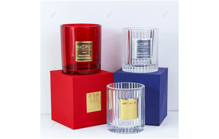
Raised metal plaques offer another label option; they are distinct from hot-stamped foil. Compare the actual sample when choosing the desired appearance.

Dive Deeper
Choosing your decoration method is a major decision in your package label design process. Let's compare the three most common options for glass packaging: adhesive labels, screen printing, and foil decoration.
For more process detail, see our guide to custom printing on glass.
Comparison of Decoration Methods
| Feature | Adhesive Labels (Stickers) | Screen Printing (Direct Print) | Hot Foil Stamping |
|---|---|---|---|
| Aesthetic | Highly versatile; full-color photographic images, various textures (matte, gloss, textured paper). | "No-label" look, minimalist, premium. Ink is printed directly onto the glass. | High-end luxury, metallic, and reflective finish. Applied directly or on a label. |
| Durability | Depends on face stock, adhesive, ink, and protective finish; assess moisture, oil, and abrasion performance on the final surface. | Depends on the ink, curing, and surface preparation; confirm adhesion and resistance under agreed conditions. | Depends on the foil system, substrate, and process; check adhesion and resistance to scratching and relevant product contact. |
| Cost | Compare stock, printing, tooling, quantity, and application costs. | Compare setup, colors, coverage, curing, and production quantity. | Compare foil, tooling, setup, and production costs for the selected design. |
| Flexibility | Excellent for managing many SKUs (e.g., different scents), as labels can be printed in batches. | Less flexible for small runs of many variations due to setup costs per design/color. | Best for logos or accent elements rather than variable information like scent names. |
Making the Right Choice
- Choose Adhesive Labels if: You have many SKUs, require complex full-color graphics, or need a cost-effective solution for a startup or limited edition. Always specify the material (e.g., paper, BOPP, vinyl) and adhesive type based on your use case.
- Choose Screen Printing if: You want a premium, durable, minimalist aesthetic and have a high production volume to justify the setup costs. It's ideal for one or two-color designs on luxury candle or diffuser packaging.
- Choose Hot Foil Stamping if: Your brand identity is built around luxury and you want a metallic finish to be a key part of your package label design. It can be applied directly to the glass or onto an adhesive label for a combined effect.
We can help you evaluate these options based on your design, volume, and budget, and arrange relevant physical samples for the agreed process.
How Can You Balance Brand Identity, Readability, and Required Information?
Your front label may look clean and minimalist, but space is also needed for applicable product information. For U.S. cosmetics, FDA guidance addresses required information and where it belongs on the package.7 Establish the requirements for your own product and market before finalizing the layout.
Plan branding and required information together. Allocate front, back, and bottom areas only where the placement and readability meet the applicable product and market requirements.
Dive Deeper
A successful package label design serves both marketing and legal functions. Neglecting either one can have serious consequences. The key is thoughtful planning, not last-minute cramming.
The Zoned Approach: Front, Back, and Bottom Labels
Think of your container's surface area as valuable real estate. Assign a job to each section:
- Front Panel: This is your billboard. It should feature your logo, product name, and primary selling point (e.g., scent). Keep it clean, attractive, and on-brand.
- Back Panel: This area is ideal for your brand story, usage instructions, and ingredient lists. Text can be smaller here, but must still be legible.
- Bottom Panel: This may accommodate selected warnings, barcodes, batch codes, or supplier details where the applicable rules and scanning requirements permit. Confirm what must remain visible elsewhere before allocating this space.
Regulatory and Compliance Text
U.S. consumer-product labeling requirements depend on the product and the responsible regulator8. Candles, reed diffusers, perfumes, and cosmetics each have their own set of rules regarding warnings, ingredient disclosure, and net weight declarations. It is crucial to research the specific regulations for your product type and target market. Consult with regulatory experts or industry associations (like the National Candle Association) to get this right. Providing this finalized text to your designer upfront prevents costly redesigns.
Font Size and Legibility
Text that looks clear on a monitor can become difficult to read at its final printed size. Evaluate font size on a physical prototype. Key considerations include:
- Minimum Font Size: Many regulations specify a minimum height for certain text.
- Font Choice: Compare typefaces at the final printed size rather than relying on a serif or sans-serif rule.
- Contrast: Light gray text on a white background might look chic on screen but offers poor readability in low light. Ensure high contrast, especially for critical information.
Which Materials and Finishes Suit Your Product’s Use Conditions?
A matte paper label that looks good in a photo may still need testing for peeling in humidity or staining after oil contact.9 The material choice is not just about looks; it's about performance.
You must select label materials, adhesives, and finishes that are specifically rated for the product's intended environment and potential exposure to moisture, oils, or abrasion. A mismatch can lead to product failure and brand damage.
Dive Deeper
The longevity of your package label design depends on the materials, printing, application process, and actual use conditions. It's a conversation that should happen early and be based on the product's entire lifecycle.
Key Environmental and Use Factors to Consider
- Moisture and Humidity: Specify the expected exposure and select a suitable face stock, adhesive, ink, and protective finish. BOPP film is one option, but assess the complete label construction. Neither a paper label nor a laminate alone establishes waterproof performance; confirm the result under the agreed exposure conditions.
- Chemical Contact: Perfumes, essential oils, and certain lotions contain alcohol and oils that can dissolve inks and adhesives. Your label material and ink system must be resistant to these specific substances. This often requires testing the label against the actual product formula.
- Temperature Fluctuations: Candles that get warm during use or products that might be refrigerated require an adhesive that remains stable across a range of temperatures without losing its bond.
- Abrasion and Friction: If your product will be handled frequently or shipped in tight-fitting boxes, the ink can scuff off. Assess the ink and any protective varnish or laminate under agreed friction conditions to determine what protection is needed.
Adhesion and Durability are Not the Same Thing10
For example, Avery Dennison lists adhesion and print-durability tests separately. Agree the checks appropriate to the selected label and use conditions.
It’s important to distinguish between two types of failure. A label can have excellent adhesion, sticking firmly to the glass, but the printing on its surface can be easily scratched off. Conversely, the printing may remain intact while the adhesive fails in humid conditions. Specify and assess both:
- Adhesion Performance: Does the label stick securely to the final glass surface (frosted, coated, etc.) and stay put during use?
- Print Durability: Does the ink resist smudging, scratching, and fading when exposed to friction or relevant chemicals?
Asking for a physical sample and performing these simple, real-world tests can save you from a massive production headache.
What Should You Check on a Physical Sample Before Production?
The final sample has arrived from your supplier. It looks good at a quick glance, but a quick glance isn't enough. Approving a sample that has hidden flaws can lock you into a full production run of defective packaging.
Before approving mass production, you must meticulously inspect a physical sample that reflects the intended production configuration. This means the correct label applied to the correct glass container with its final surface finish.

Dive Deeper
The physical sample is an important checkpoint before production. Use this checklist as a starting point, then agree project-specific acceptance criteria and production checks.
Your Pre-Production Approval Checklist
- Placement and Alignment: Is the label straight and centered? Is it positioned at the correct height, consistent with your approved specification sheet? If there are front and back labels, are they aligned with each other?
- Adhesion, Edges, and Seams: Look closely at the edges. Are there any signs of lifting, peeling, or bubbling? On a round container, how does the seam where the label overlaps look? Is it clean and secure? Run your finger over it.
- Color and Finish Fidelity: Use Pantone or a brand guide as a color reference, then approve the actual label-and-container pre-production sample as the acceptance benchmark under agreed lighting conditions. Confirm the specified matte or gloss finish as well.
- Readability of All Text: This is crucial. Can you comfortably read the smallest text on the label, such as the ingredient list or warning information? Do not just assume it's okay.
- Barcode Checks: A phone or retail scanner provides a preliminary scan check, not formal barcode quality verification. Check the encoded data, dimensions, contrast, and required quiet zones for the selected barcode and application. Where formal verification is required, agree an appropriate verifier, method, and acceptance criteria. See GS1’s barcode-quality checklist and its retail 2D implementation guidance for application-specific checks; the latter applies specifically to 2D retail barcodes.
- Overall Aesthetic and Proportions: Step back and look at the product as a whole. Does the package label design look proportional to the container? Does it convey the brand image you intended? If possible, fill the container with your actual product (e.g., colored wax or liquid) to see how it impacts the final look.
Review the proof's text, spacing, color separations and barcode details, and check color on a physical print.11 Record the approved sample and agreed tolerances; sample approval does not replace production quality checks.
How Can You Keep Labels Consistent Across Sizes, Languages, and Reorders?
Even after an initial production run is approved, a reorder may show changes in color or logo placement if specifications and changes are not controlled. Inconsistency erodes brand trust and creates a perception of poor quality.
Consistency starts with controlled artwork and clear specifications. A version-control process12 records changes to documents; for packaging, keep the approved artwork, specifications and physical reference sample together. Agree with the supplier how approved changes will be recorded. A label printer’s artwork standards provide an example of file-preparation requirements; confirm the settings with your own supplier.

Dive Deeper
Building a successful brand requires repeatability. Your customers expect the same experience every time they purchase your product, and that starts with the packaging. Here is how to build a system for consistency.
Creating a Packaging Style Guide and Specification Sheet
This is your master document. It goes beyond just the artwork file and should be shared with your supplier for every order. It must include:
- Artwork Version: The final, approved artwork file name (e.g.,
Brand_Candle_Sandalwood_Label_v3.2.ai). - Dimensions: The exact height and width of the label, including die-line specifications.
- Material & Adhesive: The specific label stock (e.g., "White BOPP with matte laminate") and adhesive type (e.g., "All-temp permanent adhesive").
- Color References: Record the agreed color references and approved physical pre-production sample; Pantone codes support the specification rather than replacing sample approval.
- Placement Instructions: A diagram showing the exact position of the label on the container (e.g., "Centered, 15mm from bottom edge").
- Barcode Information: The exact barcode number (GTIN/UPC) and its specified size.
Managing Variations and Reorders
For product lines with multiple scents, sizes, or languages, your system needs to be even more robust.
- Shared Visual Rules: Keep a consistent visual hierarchy while adapting the layout to each container size, language, and required content. Verify product details, quantities, warnings, and barcode data for every version.
- The "Golden Sample": Keep the approved pre-production sample and agreed specifications as the reference for production and reorders. Compare new samples under agreed conditions, record approved changes, and review reference samples if their condition changes.
- Supplier Partnership: A good supplier will maintain your records and proactively ask if you want to use the same specifications as the last order. They should be able to tell you if their materials or processes have changed and what impact that might have.
This level of documentation is the foundation of a scalable packaging strategy. It gives buyers and suppliers a clearer basis for comparing production and reorders with the approved design.
Frequently Asked Questions
What is the smallest readable font size on a package label?
There is no universal 6-point minimum that establishes legibility or compliance. Check the requirements for the product and sales market, then assess the typeface, contrast, print quality, and actual printed size on the final sample. Point size alone is not a sufficient readability check.
What is a die-line for a label?
A die-line is a digital template that shows the exact shape and size to which the label will be cut. For standard shapes like circles or rectangles, it's simple. For tapered or compound-curved containers, a shaped outline may be appropriate, while a straight cylindrical wall may accept a rectangular label. Confirm the cut shape and artwork area with an actual sample; a template alone does not establish fit or adhesion.
Why won't my barcode scan properly?
Possible causes include poor contrast, unsuitable dimensions, insufficient quiet zones, reflection, or distortion on a curved surface. Check the final printed sample against the requirements for the selected barcode and application. A successful scan is a preliminary check; use an appropriate verifier where formal quality verification is required.
Can I use the same label on a clear and a colored glass jar?
It depends on the design. A label with dark text on a white background will likely work on both. A transparent label can change appearance with the glass color and the fill; the same ink may be clear on one combination and difficult to read on another. You should always create a sample mockup for each container color.
Conclusion
Creating an eye-catching and effective package label design is a journey that goes far beyond a simple graphic. It is a technical process that requires a holistic view, balancing brand aesthetics with the physical realities of containers, materials, and real-world use conditions. By considering the glass shape, choosing the right application method, balancing information, selecting durable materials, and meticulously checking physical samples, you transform your label from a simple sticker into a powerful brand asset. These checks support more consistent packaging and give your team a clearer basis for production approval and reorders.
If you are looking for a partner to guide you through this complex process, we can help. At Shenzhen Bright Glassware, we can support the selected glass container and surface finish, provide AI/PDF templates and printable-area guidance, check layouts, arrange physical samples, and coordinate label printing and application. Contact us to discuss your design and project requirements.
Srivastava et al. (2022), Package design as a branding tool in the cosmetic industry: consumers’ perception vs. reality (https://pmc.ncbi.nlm.nih.gov/articles/PMC9123395/). Review of cosmetic packaging, visual elements and brand communication; it does not establish label adhesion, durability or guaranteed sales outcomes. ↩
Srivastava et al. (2022) (https://pmc.ncbi.nlm.nih.gov/articles/PMC9123395/), particularly the typography section. The review discusses readability and hierarchy in cosmetic packaging; application to a specific label still requires a physical sample. ↩
Zhang et al. (2023), Consumers’ Perceptions of the Design of Front-of-Package Warning Labels—A Qualitative Study in China (https://pmc.ncbi.nlm.nih.gov/articles/PMC9866720/). This is a qualitative study of food warning labels in China; it is contextual evidence about design and understanding, not a candle-label hierarchy test. ↩
Steiner and Florack (2023), The Influence of Packaging Color on Consumer Perceptions of Healthfulness: A Systematic Review and Theoretical Framework (https://pmc.ncbi.nlm.nih.gov/articles/PMC10648973/). The review concerns perceived product healthfulness, mainly in food contexts; it does not directly validate color coding for candle scents. ↩
DTF San Antonio, Can UV DTF Stickers Be Applied to Curved Surfaces? (https://dtfsatx.com/blogs/news/uv-dtf-stickers-applied-to-curved-surfaces). Supplier guidance about UV DTF application challenges, including bubbles and edge contact. Its advice is process-specific and is not a universal specification for paper or film labels. ↩
University of Cincinnati, Color Contrast (https://www.uc.edu/about/digital-accessibility/core-concepts/color-contrast.html). General digital-accessibility guidance explaining foreground/background contrast. The principle informs readability; digital contrast thresholds are not presented here as printed-package specifications. ↩
U.S. FDA, Cosmetics Labeling Guide (https://www.fda.gov/cosmetics/cosmetics-labeling-regulations/cosmetics-labeling-guide). Guidance on U.S. cosmetic label content, placement and legibility. It is not a candle-label guide and does not cover every destination market. ↩
U.S. CPSC, CPSC Labeling Requirements Overview (https://www.cpsc.gov/Business--Manufacturing/Business-Education/Business-Guidance/CPSC-Labeling-Requirements-Overview). A U.S. overview stating that applicable rules depend on the product and noting that some products fall under other agencies. It is not a complete international compliance checklist. ↩
Blue Label Packaging, Can Paper Labels Be Used in Damp or Wet Environments? (https://www.bluelabelpackaging.com/blog/can-paper-labels-be-used-in-damp-or-wet-environments/). Manufacturer guidance distinguishing standard paper, wet-strength paper and synthetic films. Performance depends on the complete construction and exposure; it does not establish a Bright Glassware customer incident. ↩
Volpe and Pagnotta (2026), Adhesives and Sealants in Packaging: Functional Roles and System-Level Classification (Part I) (https://pmc.ncbi.nlm.nih.gov/articles/PMC13258176/), provides broader adhesive-system context. Avery Dennison's application-testing service (https://connect.averydennison.com/en/ad-procerta/our-services) separately lists tack/peel adhesion and print-durability tests. These sources do not establish any specific label's test results. ↩
Blue Label Packaging, Frequently Asked Questions (https://orders.bluelabelpackaging.com/t/10), section on label proofs. This printer advises checking content, separations, spacing and barcodes on PDF proofs, and color on hard-copy proofs. This is a supplier example, not a guarantee for a complete production run. ↩
Version control (https://en.wikipedia.org/wiki/Version_control) explains tracking and managing document revisions; it is general background rather than evidence of packaging performance. Blue Label Packaging’s Artwork File Standards (https://www.bluelabelpackaging.com/wp-content/uploads/2022/09/ARTWORK-FILE-STANDARDS.Sept-2023-Update.pdf) provides a printer-specific example covering die-lines, fonts, color definitions and barcode files. Agree the actual production settings and approved file version with your own supplier. ↩
Keep Reading